What is a Gantt Chart? A Complete Guide for Beginners
Definition and History of the Gantt Chart
The first tool you encounter when starting project management is the Gantt Chart. A Gantt chart is a visual graphic that represents the schedule of various tasks that make up a project in the form of horizontal bars. Devised in the 1910s by Henry L. Gantt, an American mechanical engineer and management consultant, this system is still used as a standard for managing project schedules by countless companies and managers around the world even after 100 years.
In the past, it was mainly used for massive civil engineering/construction projects like the Hoover Dam or highway construction, but today it has become an essential management tool in almost all industries, including IT software development, marketing campaign planning, design agency operations, and even personal goal management.
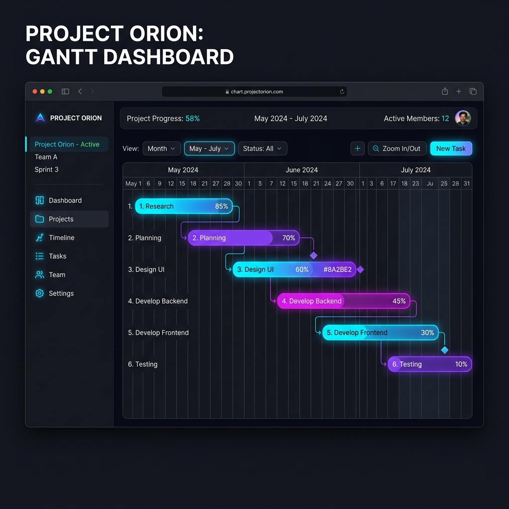
[Figure 1] Example of Rudia Online Gantt Dashboard
Core Components of a Gantt Chart
To properly read and utilize a Gantt chart, you must accurately understand its three core components.
1. Horizontal Axis (Timeline)
The horizontal axis of the chart represents the flow of time. Depending on the nature and scale of the project, it can be set in units of days, weeks, months, or even years. For example, for a short 2-week software sprint, a daily view is suitable, while for a 3-year architectural project, a monthly view is advantageous for grasping the overall flow.
2. Vertical Axis (Task List / WBS)
On the vertical axis, a list of Tasks required to achieve the project is arranged. These tasks are not just listed randomly but are hierarchically organized in a folder tree format of major, intermediate, and minor classifications, which is called WBS (Work Breakdown Structure). How logically you break down the WBS determines the success or failure of schedule management.
3. Task Bar
The horizontal bars drawn in the main body of the chart visually represent the Duration of each task. The left end of the bar indicates the Start Date of the task, and the right end means the End Date. You can intuitively know that the longer the bar, the longer it takes to complete the task. Often, the inside of the bar is colored to display the Progress (%), showing how much is currently completed.
Advantages and Limitations of Gantt Charts
Is the Gantt chart a perfect tool? Let's summarize through a table why Gantt charts are so widely used and what their limitations are.
| Category | Details |
|---|---|
| Major Advantages |
|
| Limitations |
|
Evolution to Modern Web-based Gantt Charts
In the past, people had to manually draw Gantt charts by coloring the background of cells in Excel or purchase very heavy and expensive installed software (e.g., MS Project). Gantt charts created in Excel involved the tremendous pain of manually moving and recoloring hundreds of cells with a mouse if the schedule changed in the middle.
However, modern web-based solutions like Rudia Online Gantt have perfectly solved these problems. If you move a bar with just a mouse drag and drop in the browser, it provides an 'Auto-Scheduling' feature where intricately linked successor tasks have their dates automatically calculated and pushed back by an internal algorithm. Now, you no longer need to waste time on complex documentation and can focus solely on the successful completion of the project.